
INITIATIVE FEATURE
Checkout Mitra
DURATION
- 1 Week Collaboration
- 1 Week Gather Insight
- 1 Week Crafting Design
TEAM
- Interaction Designer (Me)
- UX Writer
TOOLS
- Figma
- Maze
- Figjam
- Google Sheet
- Confluence
- Jira
SCOPE OF WORK
- Main UI/UX (product designer).
- Developed thorough guidelines.
- Oversaw the work of designers to establish design alignment.
- Worked closely with PM to define the product vision.
- Worked closely with the UX writer to create user-focused copy.
OVERVIEW
Background
Although "Mitra Tokopedia" is most known for being an e-commerce site, it offers much more than just that, it also sells wholesale and digital goods.The checkout page is used by each of these services to facilitate an ideation session, enlisting the assistance of designers to devise precise solutions and tackle prevalent challenges.
Customers currently experience inconsistently with different Checkout page designs across wholesale and digital product. Our goal is to create a uniform checkout page so that the transaction process runs smoothly.
Our goal is to develop a modular checkout page that is modeled after the idea of a department store with several departments. At Mitra Tokopedia, this centralized checkout system will function as a universal cash register, facilitating transactions with ease.
The Modular Mitra Tokopedia Checkout's Objectives:
- Standardization: Create a pattern and design that are universally applicable to all.
- Modularity: Design a checkout Mitra Tokopedia page that is flexible enough to change to accommodate various services transaction requirements.
- Maintain a smooth and uncomplicated user experience to lessen the learning curve for customers.
- Scalability: The Checkout Mitra Tokopedia page needed to be extremely scalable in order to support new services as Mitra Tokopedia continues to grow.
COLLAB & GATHERING INSIGHTS
Gathering The Current Use Cases
I began by gathering pre-existing Checkout use cases in order to get the project started. My main goal was to break down the elements that make up the checkout page and examine how the page is used. These situations fall into two different groups according to me:
Business divisions having separate pages for checkout: In this case, many business divisions kept up independent checkout systems, each with unique specifications. Digital products, for example, have a separate Checkout page from other business units.
Organizational divisions that incorporate services within Checkout: On the other hand, one of business divisions include their services in the Checkout procedure.
I worked extensively with other designers during this process to document their individual Checkout use cases on the aforementioned categories. A single Figma file that served as a centralized database holding all of the Checkout cases within Mitra Tokopedia was created by combining all of these gathered use cases.
I carried out a competitive benchmarking effort with regional and international businesses concurrently with the collection of use cases. The purpose of this exercise was to find design patterns that our checkout system might use.
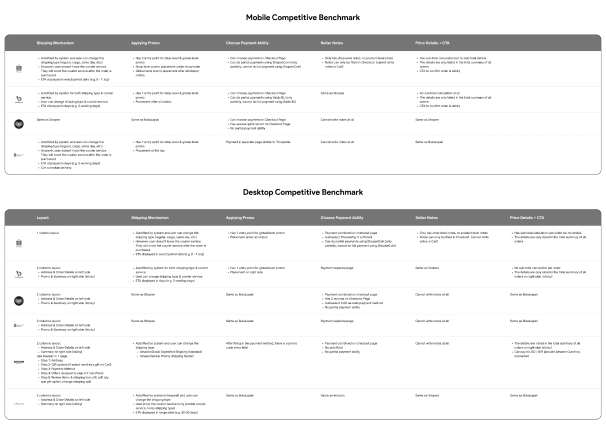
Figure 1. Competitor Analysis
It is important to recognize that Checkout Modular users are not just consumers, they are also members of the Mitra Tokopedia internal teams, such as designers and developers. Three user categories are identified by this all-encompassing viewpoint:

Figure 2. Users of Checkout
Furthermore, I looked over historical research data to have a deeper understanding of our primary audience at Main Tokopedia, which is purchasers. In the past, we've polled customers to learn what they think is crucial to know while checking out. The most crucial elements were determined to be comprehensive price and product information based on the survey's findings. It is crucial to make sure that consumers are fully aware of the entire cost of the item they intend to purchase.
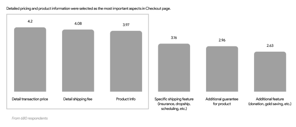
Figure 3. Survey Result
We may infer from desk research that the checkout process, sometimes known as a conversion funnel, is the last phase in the purchasing process for customers.

Figure 4. Conversion Funnel
Before confirming the order, customers can review the product or service they have chosen in this final step. Additionally, it is a location where purchasers can get crucial assistance in making decisions. As the final stop on the shopping trip, the checkout page encourages and assists customers to finish their purchases.
I used the use cases, benchmarks, and prior research that I had gathered to facilitate a co-design session with over fifteen designers. The major goal was to collaboratively rethink how we could create the perfect checkout page in order to establish auniform pattern that can be scaled for future requirements and adjusted to other business units.
CORE PRINCIPLES
Checkout Information and Value Proposition
Going forward, I developed design principles as standards and a clear direction for the Mitra Tokopedia team before diving into the design process. These guidelines serve as a compass, ensuring that decisions about design are in line with a predetermined set of goals and values.
Initially, we must respond to the query, "Do my products/services require checkout?" If it meets these three requirements, then the answer is yes:
- Order Review: Required. When customers need to check their orders, a checkout process is required. This gives customers a summary of the products and the overall price they are buying. Before completing their transaction, customers ought to be allowed to scan all order data.
- Accepted Modes of Payment. Goods and services must be paid for via payment methods.
- Entered into the Order History. The goods or services must be noted in the user's order history for future reference and tracking after payment.

Figure 5. Value Proposition
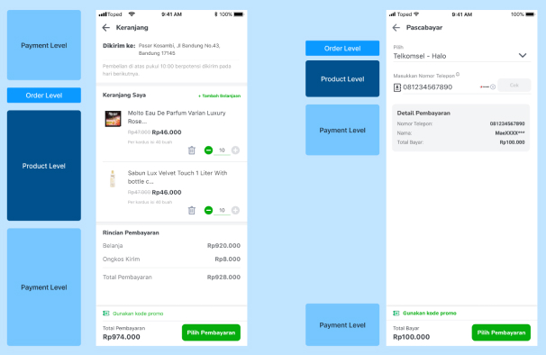
I carefully reviewed the Information Architecture (IA) and looked for patterns, building on the knowledge gained fromco-design workshops and completed use cases . Three main levels make up the hierarchical structure that resulted from this analysis: Payment, Order, and Product.
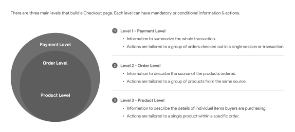
Figure 6. Information Architecture Mapping
I carefully reviewed the Information Architecture (IA) and looked for patterns, building on the knowledge gained from co-design workshops and completed use cases. Three main levels make up the hierarchical structure that resulted from this analysis: Payment, Order, and Product
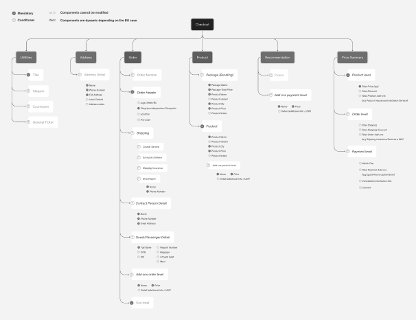
Figure 7. Information Architecture Level
DESIGN GUIDELINES
Design Guide
Our mobile platform provides two different Checkout experiences in the live version:
Standard Checkout for Wholesale Product.
There is a separate Payment page for this type of checkout. Following checkout, there is a specific page for the preference destination address.
Other Checkout (Separated) for Digital Product.
With this check-out type, there's no preference destination address.
This method simplifies the changeover while preserving uniformity across the Checkout process.
KEY TAKEAWAY
Next Action and What I've Learn
There are still a few crucial design steps that must be finished:
Testing Usability and Improving the Design
The next step is to carry out thorough usability testing to guarantee the Checkout Modular system's optimal use. The overall user experience will be improved by refining the design through analysis and utilization of user insights and feedback.
Initial Project
We will investigate the feasibility of starting a pilot project for the Checkout Modular system after the design has been improved. In order to make sure it fits with our project goals and provides the best possible user experience, we will be able to actively monitor its impact and collect further user feedback during this period.
Socialization of the Complete Outcome
Arrange a last round of socializing to explain the significance and launch of the Checkout Modular system. Make certain that everyone involved in the system is aware of its development.
Preserve the Documentation Playbook.
Maintaining a thorough documentation playbook that covers every facet of the Checkout Modular system in close coordination with engineers. This documentation will be an invaluable tool for future instruction and reference. It will include important details like how to use the system's components and request new ones, as well as how to transfer the current Checkout pages to the new one.
The Checkout Modular Project was a life-changing opportunity that gave me the tools I needed to solve challenging problems, develop scalable solutions, and promote teamwork. Working with multiple parties was one of the biggest obstacles. I learned how to facilitate conversations among team members to attain alignment from this experience.
I stressed the value of iterative design all throughout the project. In addition to buyers and sellers on Mitra Tokopedia, the designers and engineers who depend on this specification are also users of the Checkout Modular. I gained the knowledge to aggressively pursue early feedback and to keep our options open to revision in light of insightful stakeholder feedback. The Checkout Modular standards have been significantly enhanced by this iterative process, which also keeps them current with Mitra Tokopedia's services and environment.